Showing posts with label Universal Design. Show all posts

Monday, August 30, 2010

In Which I Show You Our Completely Awesome "Oxygen In Use" Signs

So remember way back in March when I wrote about how we'd commissioned some stylish "Oxygen In Use" signs for our house?  We're required by the Fire Marshall here to post them since we use an oxygen tank whenever Connor has a seizure, but we weren't happy about the idea of posting one of those giant, nursing-home-type signs in the front window of our house. 

Since they don't have any regulations about what the sign looks like so long as it's clear on the "you can't smoke in here because there's oxygen in use" part, we figured we'd post an Alchemy request on the crafting site Etsy and see what we could come up with.  As several of you requested, I'd intended to show you the signs that came out of that project but I never got around to it.  Well, no time like the present!

We needed three signs-- one for our front door, one for our patio door, and one for the cabinet where the oxygen equipment is kept.  Over twenty artists made concept drawings for the signs, and it was an extremely tough decision trying to figure out which to go with!  In the end we chose a different artist for each sign: Chileary in Colorado for the sign in Connor's room, Metroink in Colorado for the front door sign, and Amberbrien in Montana for the sign on the patio door. 

There were some other artists with beautiful concepts-- so many that we wished we had more doors!  A couple of real standouts included Cjaneb877, who suggested ten different interchangeable seasonally-themed signs for Connor's room, and Montage, who proposed a front door sign that included distressed wood and stained glass elements.  You can see why it was hard to choose!

Anyway, here are the signs we ended up with:

Chileary did our front entry sign in green slate to compliment the colors of our house.  They took an element from the window in our front door and used it as a decorative accent. 

Amberbrian went with an Art Deco style for our patio door sign.  The vinyl window decal should hold up well to the weather, and the colors are drawn from the interior of our home. 

Metroink created a fun, lighthearted sign for Connor's room.  The simple laminated sign cleans easily and works well with the colors and decor.  The text reads "No Smoking!  (We've got oxygen in here!)" and there's a picture of an explosion with oxygen tanks flying out from the blast.

So there you have it!  We absolutely love the signs; I am a firm believer in the idea that just because something is required for a person with a medical condition doesn't mean it needs to be ugly, and to my mind these fit my principles to a T!

~Jess

Saturday, April 3, 2010

In Which Connor Gets His New Bed!

Connor got his big boy bed today! 
Connor outgrew his crib a while back, and we'd rigged up a solution while we tried to figure out what to do next.  He definitely needed more of a railing than a toddler bed was going to give him, and he needed to be tilted up on the bed, but the only beds we could find that did everything we needed them to and would be covered by our insurance looked like giant metal cages.  Enter Bill Hines.

Bill (with Signature Custom Homes) came up with a design, and he has been working on this beautiful (and huge) piece of furniture for weeks.  I swear the man is a genius.  Not only does the bed blend beautifully with Connor's other furniture, but it suits our needs remarkably well.  It's the perfect height for me to slide Connor on and off the bed easily, once we've latched the side he's secure (since he doesn't stand there's no problem with him potentially climbing over) and with the application of a simple cordless drill the entire top third of the bed rises up as high as we need it!  Here I am applying the drill to get the bed ready for Connor sleeping in it tonight-- it looks jerky only because I am a drill novice and wasn't pushing the trigger smoothly.  How cool is that?

All of the wires for Connor's medical equipment feed through the bed so they're not within his reach, and there's extra storage for his supplies underneath.  Perhaps best of all, it does all of this without looking like an oversized crib or a giant animal cage.  And Connor is super, super excited about it-- he absolutely loves it!

Perfect.

~Jess

Tuesday, March 16, 2010

Room By Room: Connor's Room

And last but certainly not least, here's Connor's room!

I have to tell you about the last owner's inspired decorating scheme in here.  While normally I'm not one to criticize anyone's personal tastes, this room kind of takes the cake.  This is the only room in the entire house, including the bathrooms, that did not have a stenciled design in it.

They had a dartboard hung in here.  A harvest gold, kelly green, and crimson dartboard.  Design inspiration!  You can see the glorious results in the slideshow after the jump.

Monday, March 15, 2010

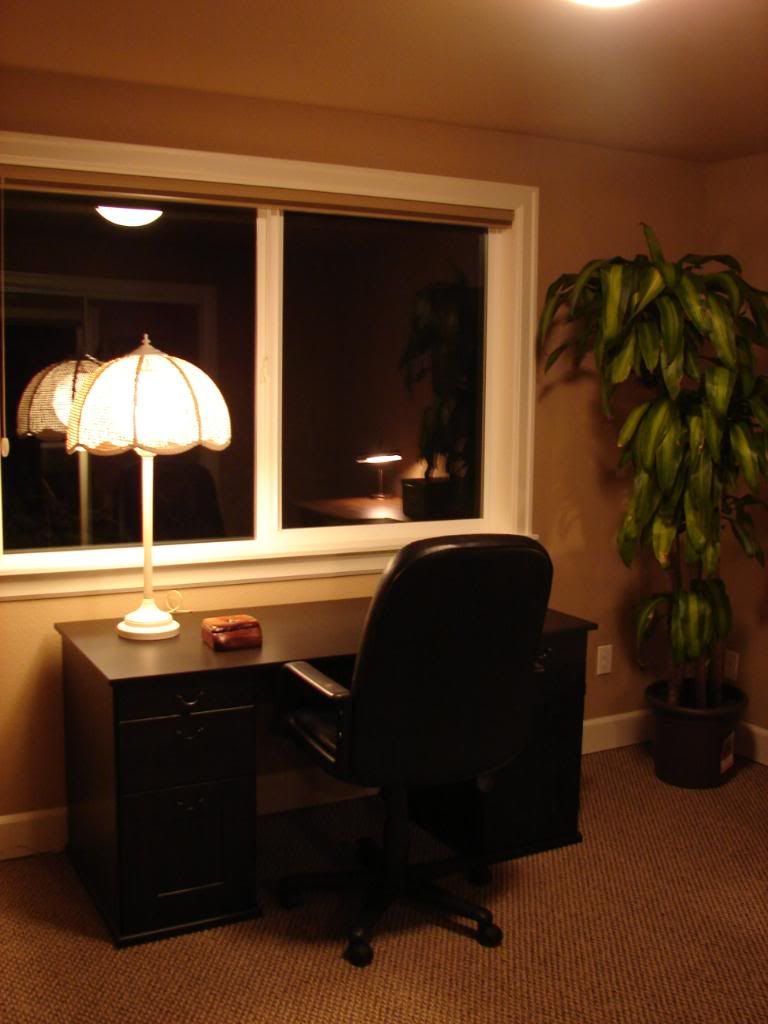
Room By Room: The Office

Here's the office!

If we adopt a little girl this will be her room, but otherwise this is where our office/guest room will stay, as if we adopt a little boy we'll be making him share a room with Connor.  This is for a variety of reasons, the main one probably being that we like having an office/guest room.  Sharing rooms builds character.

Right.  Anyway, this room was a totally unremarkable white (excepting the ever-present stencils) box, decked out with vintage 1980's ruffled floral pattern curtains.  This room, along with Connor's room, also sported one of those narrow little passageways to get inside with a standard (non-wheelchair size) door.  There was no way that could open the door wide enough to squeeze through, even if he had someone push him through instead of trying to wheel himself.  Slideshow after the jump.

Sunday, March 14, 2010

Room By Room: The Master Bedroom

Here's our bedroom! 

This is a huge room.  And when I say huge, I mean huuuuuuuge-- the kind of bedroom that architects generally say is a total waste of space in a house with this amount of square footage.  That's a king size bed languishing in the middle of the room in the "before" picture, which gives you the general idea of just how large this room is.  We briefly considered making this Connor's room before we decided that, nah, we couldn't resist having that space all to ourselves.  I'm so glad we did, too, because I'm relatively sure a king-size bed wouldn't fit in Connor's room very well, and after sleeping on the floor for the past five months (we couldn't fit Jeremy's hospital bed and a bed for me in the same room, so I've been carpet camping since early September) I am swooning over this bed and spend as much time in it as humanly possible.  Slideshow after the jump!

Saturday, March 13, 2010

Room By Room: The Bathrooms

Ah, the bathrooms.  The master bathroom was a large part of why we bought this house in the first place, so I have a special fondness for it, or at least I'm as fond as you can be of a room with a toilet in it.

We sure as heck didn't buy the house for the bathrooms as they were.  The original bathrooms were like walking into a time warp to the eighties, complete with fake beige marble vanities, stenciled walls, random earth-tone flower tiles, and those hideous hanging light fixtures, which I'm sure have an official name but which Jer and I termed "nipple lights" for obvious reasons.  By far the biggest asset of either bathroom was the fact that the master bath backed up to a pretty large walk-in closet, making it ideal for remodeling into a larger roll-in shower.  Of course, we never anticipated that thanks to some amazing people we would end up with a couple of bathrooms as gorgeous as our new ones turned out!  Slideshows for both bathrooms are after the jump.

Friday, March 12, 2010

Room By Room: The Mudroom

On to the mudroom!

This is by far the largest laundry room I've ever had in my entire life.  It runs the entire length of the kitchen, and the washer and dryer were stuck waaaaaay over in one corner, and the passage to the garage was waaaaaaaay over in the other corner.  The water heater also used to be in this room, and every time you turned on the hot water in the house it sounded like some sort of Thing From The Swamp was rising up in my mudroom to drag us all to a watery grave.  Seriously the thing scared the bejeezus out of me the first time I heard it.  While ordinarily I'm a fan of pocket doors, the tiny one in here that led into the kitchen was so narrow that Jeremy's chair couldn't fit through it without scraping the walls, and the door track had settled so that the pocket door would stick and scrap against the jam.  An extremely odd coat closet with two doors-- one on the kitchen side and a really narrow one (about eight inches wide!) on the mudroom side added a slightly bizarre touch.  Really the rest of the long narrow space in here was wasted.  The slide show of the construction process is after the jump!

Thursday, March 11, 2010

Room By Room: The Dining Room


Today I'm going to talk about the dining room!  The space was formerly being used as a family room, and was dominated by a large woodburning stove, which was nice but rather outdated.  Since we now had a gas fireplace in the living room, the odds of us taking the time to set up and use this stove when we could just flip a switch and have instant fire in the other room were not very good.  Also once the kitchen was expanded it no longer made sense for the roomto be a family room, as it was really too small to fit a couch or television in.  Finally, if I wanted a library the dining room had to be moved somewhere.  So we said goodbye to the family room, and trust me; we're not missing it.  Check out a slideshow of the construction progression after the jump.

Wednesday, March 10, 2010

Room By Room: The Kitchen

On to the kitchen!

Before the remodeling this kitchen was, in a word, appalling.  Not only did it still have the original 1984 oven and dishwasher, but that year also appeared to be the last time they had been cleaned.  The inside of the oven was literally black with burned drippings and grease.  Rotting food was left in the cabinets and under the sink.  In the "before" picture you see a nice refrigerator and microwave; the previous owners took both of those with them when they moved out.  The industrial carpet (yes-- carpet in a kitchen) was badly stained, and the previous owners had cut mats of the same carpet and simply laid them over the worst of the stains in an attempt to disguise them.  The grout on the tiled kitchen counter was black with mildew.  A ceiling dropped eight inches lower than the adjoining space meant I could reach up and easily touch it with my fingertips.  A small pantry, message center and oddly shaped coat closet lined the wall that led to the mudroom door, and Jeremy was completely unable to fit through the narrow entrance into the mudroom beyond.  The microwave area (had there been a microwave) was completely inaccessible to anyone in a wheelchair, as was the sink and cooktop.  Slideshow of the progression after the jump!

Tuesday, March 9, 2010

Room By Room: The Library


This is probably my favorite room in the house.  Though I also love the kitchen.  And the living room, and the bedroom, and well okay every room in the whole house is a pretty close runner-up.  I'm not even sure if you ccan technically call the library a separate room, as it's more like an alcove in the living room.  But this is my blog so I get to call it what I want to, and "reading alcove" doesn't sound nearly as exciting as "library."  So library it is.

Anyway, this room was originally the dining room of the house, but the strangely shaped alcove on the back wall was just begging for a built-in, and when the folks at Signature Custom Homes learned about my modest little book collection they suggested that a library for me would be the perfect conversion for this room.  I'm so glad they did!  You can see a slideshow of the whole remodeling process after the jump.

Monday, March 8, 2010

Room By Room: Living Room

So the living room had a lot of work done.  For starters, it had a sunken floor with a single seven-inch step down (which, if these wonderful folks hadn't remodeled for us, means that we would have had to have had a seven-foot long ramp into the living room).  The windows, while dramatic, were original to the house and if you stood next to them you could feel the cold radiating off of them.  Also they weren't made of tempered glass, which meant that they weren't to code and that if Connor eventually graduated to a power wheelchair he might potentially be able to drive right through them.  The fireplace hadn't been serviced in so long that the chimney cap was literally falling apart and as a result the flue damper had rusted open.  The wooden railing dividing the living room from the entry and dining room (now library) was for show only-- it was wobbly enough that it was pretty obvious leaning on it would be a really bad idea.  Two measly can lights were the only illumination in the whole room.  You'll find a slideshow of the whole remodeling process after the jump.

Sunday, March 7, 2010

Room By Room: Entry

As promised, here's the first in depth room-by-room talk about the house!  I've included a slideshow after the jump so you can see the construction process, and I want to tell you about the modifications that were done to make the house more accessible (and also gorgeous).

I think that it's appropriate to start with the entry.  The modifications start just outside the house, where the steps were replaced with a sloping walk that follows the path of the original walkway and is easily to navigate in a wheelchair.  The new zero-threshold door ensures that Jeremy and Connor can roll through with no big bumps on the way into the house.

Saturday, March 6, 2010

Our New Home: The Big Reveal!

Okay, here we are-- the big reveal!  I'll just post a single before and after photo of each of the rooms today so this doesn't get too picture heavy, and then I'll do posts on individual rooms later in the week.  The only room not here is the library, which I posted a shot of yesterday. 

We held an Open House today (more on that tomorrow) so that everyone who helped out with the house could come back and see it, and also to meet some of the neighbors.  It went wonderfully, and it was so great to meet or see again the people who made it happen! 

I still can't believe that we actually get to live in this house.  I feel like a kid in a candy store every time I walk in right now.  But enough talking-- on to the pictures!

Monday, March 1, 2010

In Which We Look For A Stylish Sign

So since we're about to move into this gorgeous new house, I've been thinking of ways to keep the home from looking like a medical facility.  Smart storage and a beautiful custom bed for Connor will go a long way, but there's one thing that's been bothering me.

Connor uses oxygen whenever he has a seizure.  So right smack dab in the front window of this stylish house, we have to post one of those nasty signs warning people not to smoke because there's oxygen in use in the home.

These are not the most stylish of signs. 

We have to have one by each of our entrances into the home-- pretty sure they're required by law-- but nothing says that we can't make the sign a little nicer, so long as it's legible and contains the information needed.  We know no one's going to be smoking in our home (or at least they better not be) so the sign is more for firefighters in case the house is on fire and we need to make sure they know that it might, um, blow up.

So anyway, late last night I logged onto Etsy-- that wonderful addictive website chock full of vendors of handmade goods-- and put in an open request for a stylish home oxygen sign via their custom request process (alchemy).  I specified that the medium, whatever it was, needed to hold up well to direct sunlight, and included a picture of the area the sign would be hung in as well as the names of the paint colors used inside and outside our home.

I figured if I was lucky I'd get one bid-- this isn't the sort of thing most people are requesting, after all.  Home oxygen signs are probably not the most exciting of design challenges.  But lo and behold, by the end of today I had thirteen vendors who were interested in making us a sign!  Proposed mediums included everything from laminated paper to wood to vinyl to stone.  We've asked all of them to submit a design sketch and we'll choose three of the designs-- one for each door.  I'm really psyched to see what they will come up with!

If you guys are interested, I'll see if I can get permission to show you all the finished products once we've made a decision and have them in our hot little hands!

~Jess

Picture Source: http://www.freesignage.com/osha_danger_signs.php

Sunday, February 28, 2010

In Which We Go To The Seattle Home Show, With Mixed Results

Today Jer and I once again left Connor with our fantastic respite care worker and went out!  It's nice to have a little time to play since this next week is going to be so crazy.

So we threw the crutches in the car and drove up into Seattle to catch the last day of the Seattle Home Show and see what kind of exciting new forays into Universal Design we could find.  The results were rather mixed.

On the one hand, we did find this absolutely gorgeous Universal Design prefab model home, called the FabCab, which was set up to be fully wheelchair accessible.  Jer and I talked with the architect for a while and then wandered around inside.  It was pretty neat, and it was very interesting to compare our new house with the model to see how similar design requirements were executed in different ways for very different looks.  That was by far the highlight of the day, and made the trip up more than worth it!

We also walked past a large number of elevator and lift companies.  Nearly all the appliance companies had front loading washers and driers, French door and bottom freezer refrigerators, and induction cook tops as a matter of course.  And we did see a couple of bath companies featuring accessible bathtubs and showers. 

Now for the downside.  Other than that one model home, we saw zero examples of accessibility in home builder, interior designer, or model kitchen displays.  Not one roll-under counter top or island.  Not a single lowered counter.  Not even a picture of one.  And this was not exactly a small home show, as you can see.  That photograph I took is of one third of the main floor of the show.  We were standing on the second floor (with even more booths) when I snapped it.

The other two model homes there had wheelchair ramps tacked on as an afterthought and absolutely no other concessions to accessibility of any type.  Both ramps were at the back ends of the houses (and added nothing to the decor, being standard ho-hum uncreative varieties).  In one case the ramp had an "exit only" sign on it.  Seeing that the only marked entrance seemed to have a large number of stairs up to it, I ran up and asked the builder where the accessible entrance was.  He pointed us to the exit ramp.  So we walked up the ramp and through the back door, to discover that the line of people going through the house of course went one way, and we were now walking upstream.  Glorious.

The other model home had a relatively long line to get in.  The ramp was around the corner, hidden from the line.  We asked the gentleman standing outside the ramp if that was the way to get in. 

"Yes, but there's a line," he said.  He pointed to me.  "You'll have to wait in it."  He pointed to Jer.  "You can wait here."

There was no way to see the ramp from the entrance of the house.  Apparently I was supposed to wait in line until I made it to the front, immediately walk through the house (in another one-way line) to the exit, pop my head out the door and let Jer know that he was now allowed to walk up the ramp.  Then we could once again fight our way upstream to see the interior of the house. 

I mean, I'm not saying we should be allowed to cut in line.  But come on-- seriously?  Obviously accessibility was an afterthought with these houses-- the general line of thought seemed to be "let's make all the disabled people go up the back because accomodating them would make the front of the house ugly."  That's more than a little insulting.  Granted, these are all prefabricated homes.  But it still seems to me that there could have been a little more thought put into this, even if the home layout couldn't have been changed.  The ramp had to go on the outside of the house, after all.

And some of the comments made by vendors as we were walking by were just plain rude.  Jer had shorts on as it was a lovely, sunny day outside, so his heavily scarred calf with its interesting profile was visible to all.  One gentleman called me over and handed me a bunch of candy, telling me that Jeremy was "so brave to be out like that."  Vendors hawking various pain management solutions (they're at every home show I've ever been to-- don't ask me why) were yelling at us down the aisles about how they would miraculously cure Jeremy's nonexistent knee and back pain.  Another guy tackled us in the parking lot and shoved one glass pebble in Jer's pocket and another in his sock "free of charge," telling us that they would "help his nerves make the connection."  He asked Jer if the problem was a staph infection.

I think the most befuddling one was the lady who yelled: "HEY!  WALKING WOUNDED!" at the top of her lungs and gave Jer an excited wave as we walked by in a sort of stunned silence.  I can't even remember what she was selling-- I think it was windows.  I mean, who does that?  We considered going back by and yelling "HEY! STANDING UGLY!" but ultimately decided to take the high road. 

So all in all I'd say that the day sort of balanced; the sad design concessions and odd interactions with people were kind of canceled out by the sheer awesomeness of the accessible prefab home.  At any rate, we finished up the day with some yummy Italian food and our usual date pastime: reading at one of the myriad of coffee shops we patronize.

It was a pretty good break.  Now it's back to business!

~Jess

Wednesday, February 17, 2010

In Which I Show You The House As It Currently Stands

Here's that picture-heavy house update as promised!

Just look at that beautiful fireplace!  All of the stone went on today-- including a beautiful flagstone mantelpiece-- and the floors are now finished in the mudroom, bathrooms, kitchen, dining room, living room, and library!  All of the indoor light fixtures are in, and the mudroom bench is painted.  The kitchen vent and Connor's ceiling are both primed and ready for their faux paint treatment.  This is a very long, very picture heavy post, so I'm putting in a jump so it won't take forever to load.  You can click on "read more" or on the title of the post to see all the pictures.  I've included "before" shots so you can see just how amazing the transformation has been so far!

As an aside, please note that all of the furniture in the before shots is not mine, but the previous owner's furniture, as I took the pictures shortly before we closed on the house.  While I freely admit that I am rather odd, I do not keep a display case full of gift boxes in my family room.  Really, I swear.

Anyway, on to the pictures!

Monday, February 15, 2010

In Which The House Is Almost Finished And I Am Behind On Packing

Oh man, I'd better hurry up on the packing. 

We met with Becky of Signature Custom Homes over at the house today, and they plan to be finished in a week!  You wouldn't believe how quickly things are moving over at the house now.  While we were there they were hard at work on the beautiful floors; they'd already finished the kitchen, library, and living room, and were up to the entryway when we left.  The second coat of paint on the walls and all of the touchup paint had been finished.  A stunning mudroom bench had also been added in the laundry room as a surprise!  Pictures tomorrow, as I didn't bring over my camera tonight. 

I can't believe that we're that close to moving in!  I have some serious packing to do-- I've been slacking off in a major way since we've all been sick over here.  Jeremy is pretty much over his illness, though he's still a little tired.  I'm still pretty lethargic and still have a sore throat, but otherwise I'm good.  Connor had a lot more energy today, but he's still snorting like a miniature enraged bull.  He's down for the night, and it's really easy to make sure that he's still breathing right now because we can hear the rattling snores quite clearly through the monitor.  We'll see how he feels tomorrow, but my guess is he'll probably miss yet another day of school.  Luckily it was a holiday today and he has Wednesdays off so he's missed less school than he would have otherwise.  I'm sure by Thursday he'll be well enough to go back.

I'll be really happy when he's not sick anymore, because while he has a stuffy nose he becomes a mouth breather, and somehow while he's breathing through his mouth he loses the ability to swallow anything.  We're talking massive amounts of drool here.  He's soaking through three or four outfits a day right now.  He also doesn't want to eat anything by mouth, of course, because he doesn't want to have to try to breathe through his nose while he swallows.  Thank goodness we have the g-tube! 

Also thank goodness for washing machines!  I don't even want to think about how much fun all this stuff would be to wash by hand.

~Jess

Monday, February 1, 2010

In Which I Talk About The Home And Garden Show

So the Tacoma Home and Garden Show on Saturday was fantastic! There were literally hundreds of different displays-- everything from flower seed vendors (I bought myself some purple poppies) to roofers to cookware sellers to interior designers. It was really neat to get a chance to see the latest products and to get an idea of some of the trends for 2010!

We didn't linger over any particular site because Connor was a tad bit (read: WAY WAY WAY) overstimulated what with the crowd and the noise and the lights, so we just did a quick run-through of everything. It still took us almost three hours just to go through all the displays, though, which tells you how big the show was!

While I enjoyed looking around at all of the gorgeous displays, I really had my eye out for evidence of Universal Design. Universal Design, for those of you who don't know, is based around the idea of designing beautiful spaces and objects for use by everyone-- not just those between the ages of 14 and 70 without any disabilities. Our home is being remodeled using Universal Design principles, and to my mind they make perfect sense; in fact I sort of wonder why it's taken so long to catch on. It's getting harder and harder to visit the homes of a lot of our friends; almost all of the homes around here have entryways with a number of steps up to the front porch, as well as narrow hallways and bathrooms. There's also the fact that people age and can no longer stay in homes with long stairways, inaccessible storage, and so on, not to mention that injury or illness can strike without warning at any age, making living in a nonaccessible space extremely difficult. You can read more about the principles of Universal Design here.

While formerly a luxury trend, the good news is that it looks like Universal Design is finally starting to trickle down into mainstream design! French door refrigerators with wheelchair-friendly bottom freezers were standard fare in almost all of the display kitchens. Front loading washers and dryers were also in evidence, and we saw several accessible toilets and roll-in showers. There were a few vendors who even had displays that specifically mentioned accessible design and pictured some beautiful examples. Most, if not all of these were directed at those who wished to "age-in-place," however, and I never actually saw the words Universal Design mentioned anywhere.
There were still a lot of examples of the type of nursing-home/hospital THIS PERSON IS DISABLED AND THEREFORE WON'T CARE IF THEIR HOUSE IS UGLY design that has no doubt been frustrating disabled homeowners for years. With one lovely stainless steel exception all of the grab bars I saw were the white ho hum variety. There were also a number of hideous prefab roll-in shower designs (I know they're supposed to be inexpensive, but surely it is possible to design a remotely attractive accessible one that doesn't have the white molded tile, right?) and several prominently displayed walk-in tubs, which have yet to graduate from the all-white-acrylic-box look. Jacuzzi has made a slight effort, offering theirs in almond, white, oyster and black, and outfitting them with jet and Chromatherapy lighting systems, but they still have a long way to go on the appealing design front.
I saw zero examples of accessible landscaping, however. That was sort of depressing.

Anyway, back to the good stuff! I saw several companies that would retrofit cabinets for sliding shelves. Also in evidence was the current trend of oversized cabinet pulls, which offered a lot of variety. My personal favorites were these awesome climbing guys from the Soko San Francisco Manhandles collection, which were way, way out of my price range. But hey, a girl can dream, right? Wouldn't they be fantastic on those built-ins in Connor's room?

I'm encouraged by what I saw at the show, and am hopeful that Universal Design principles will continue to trickle down into more affordable ranges for those of us that don't have huge design budgets but want to keep our houses looking like homes and not medical facilities. I'll be headed to the Seattle Home Show in a couple of weeks and I can't wait to see what I'll find there!
~Jess
 
Blog Directory